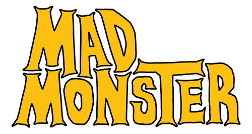
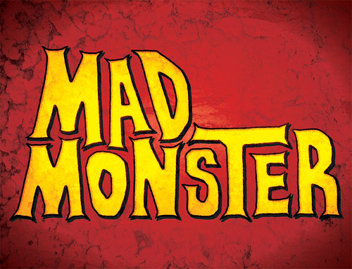
For this year’s Rochester Movie Makers Summer Shorts, we are introducing a linking motif. For those who wish to take part in a larger anthology film, our writers are incorporating a MacGuffin — in this case a red lunchbox. We wanted to give that lunchbox some personality, so I proposed some fictional branding. It’s important to avoid copyright issues (like if we used a Spider-Man lunchbox) so our prop will be emblazoned with the MAD MONSTER identity.
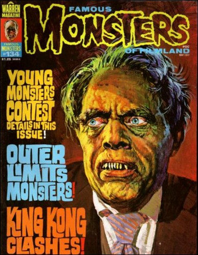
I’ve spent the last couple days working on the perfect retro font style for the Mad Monster. My goal is for the box itself to be a product of the monster mania of the 1960s. Universal monster movies were playing on TV to kids who’d never seen them before. Their popularity led to Aurora model kits and publications like Forrest J. Ackerman’s Famous Monsters of Filmland.
I imagine that a character like Mad Monster would have appealed to those kids. He appeared on lunchboxes, but is now almost completely forgotten. Those lunchboxes are prized collectibles today.
To find the right inspiration for the design, I looked at magazines, toys, and comics of the era. I especially examined the covers of Famous Monsters. I like the the letters in the left column interlock with each other.
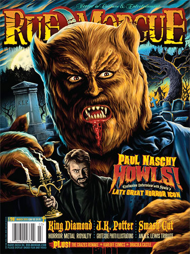
I also thumbed through an issue of today’s greatest horror publication, Rue Morgue. Check out the font used in the lower right, for the name Paul Naschy. The spiky serifs seemed like a good way to go.
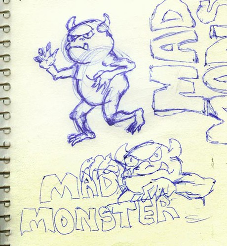
After countless drawings, I scanned my favorite treatment and applied color and texture. The next step will be adding the monster character. (The font had to be done first so I would know what shape he’d be leaning against.)
You may also like this
How to write a screenplay for free?
Short Script: In Deep

Talking Hero of the Underworld on Eggwork Radio
4K Animation
[…] INTERROGATION When will I get the chance to do my own Lunchbox short? I’ll have to squeeze that shoot in soon, then get to work animating the monster […]