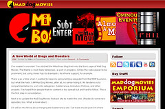
Last week’s beige and gray design has been kicked aside like a tumbleweed. Now we have something simple, yet striking. It’s got the black and red and white scheme I’m so fond of, but the really special bit is the header. The sliding images which make up the menu can take visitors to any section or sub-site in the Mad Dog Movies Universe (TM).
Let me know what you think. Too many choices? Too few words of explanation? I’m trying to streamline this baby, not confuse people.
-M



Mike!
LOVE the new site. :) Very slick. Out with the old, in with the new!
The sliding tags up top are super cool.
Cheers,
Jeff
Thanks, Jeff! Nice to get some feedback.