-
 READ MORE
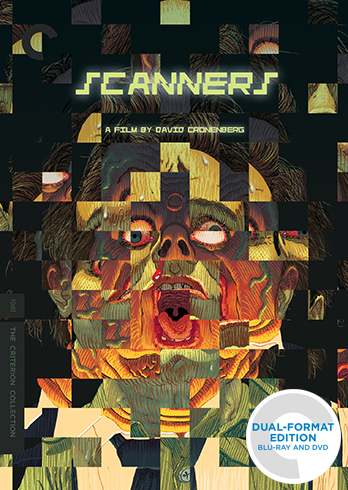
Back in the fall of 2012, I did some animation for a bonus feature that Elijah Drenner produced for Subkultur Entertainment’s Blu-ray release of Scanners in Germany. David Cronenberg’s films are some of my favorites, so it was a thrill to work on. Today I’m proud to announce that the Criterion Collection is picking up […]
-
 READ MORE
Sure is cold out there.
-
 READ MORE
Truly an epic that needs to happen.
-
 READ MORE
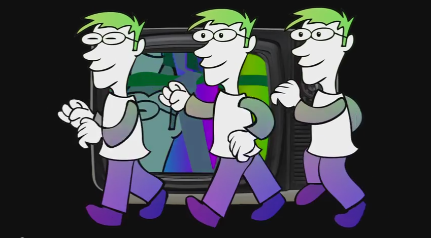
Something new for the new year! A series of animated GIFs by me, mostly of goofy characters.
-
 READ MORE
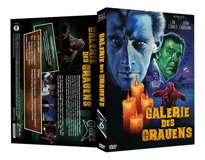
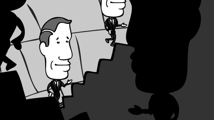
Recently, I’ve been doing some animated titles for Elijah Drenner of END Films, whom I previously worked with on American Grindhouse. These are fun assignments, usually done to imitate the style of other movies. For instance, here’s the opening to a piece on John Carradine, for Subkultur’s German DVD release of Gallery of Horrors. For […]
-
 READ MORE
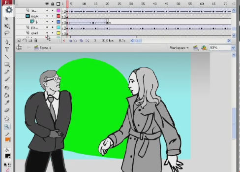
I’ve posted a snappy new animation reel on Youtube. If you like, click on over and “like” it or “comment” it or whatever the kids are doing today. If you REALLY like it, my services are available for hire. Contact me today about animating titles or logos for your movies or video productions. I thought […]
-
 READ MORE
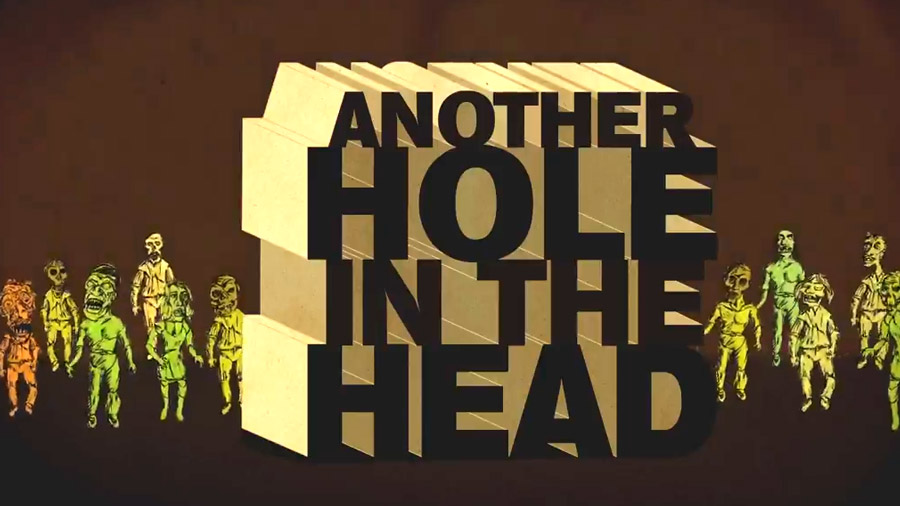
After many weeks of false starts, I finished work on my animated promo film for the “Another Hole In the Head” horror film festival. Some time ago, Eric Ringer contacted me to see if I could do something for the horror arm of the San Fransico Indiefest. Sure, I said I’d love to… but finding […]
-
 READ MORE
When Aaron Vanek asked me for an animated promo for this year’s H.P. Lovecraft Film Festival event in Los Angeles, I knew I couldn’t resist. I also knew I was in the middle of about 12 other projects and I’d have to carve out the time to do it. So I spent this past Labor […]
-
Animate This! / Community / NOTLD:R / Subterranea February 9, 2010
 READ MORE
We all like going behind the scenes, right? When Mike Schneider, director of the Night of the Living Dead: Reanimated project, asked me to contribute a featurette to the upcoming DVD release, I was afraid I wouldn’t have the time to do so. Well, last week I gathered strength and put together a 6 minute […]
-
Animate This! / Community / NOTLD:R / Subterranea July 28, 2009
 READ MORE
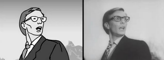
Now that I’ve completed three scenes for the Night of the Living Dead: Reanimated project, I thought it might be cool to show my cartoon shots next to the original movie footage. You’ll see where I applied faithful rotoscoping and where I deviated from the original acting. The following video clips show the animation, then […]