Back in the fall of 2012, I did some animation for a bonus feature that Elijah Drenner produced for Subkultur Entertainment’s Blu-ray release of Scanners in Germany. David Cronenberg’s films are some of my favorites, so it was a thrill to work on.
Today I’m proud to announce that the Criterion Collection is picking up “The Ephemerol Diaries” for inclusion on their U.S. Scanners release. So, there you have it, my animation will be on a Criterion disc. Yowza!
Back when we were conceiving the piece, Elijah and I wanted to emulate the experience of a VHS industrial video. I took the Consec logo from the film and tried to imagine it as part of a 1980s era logo sequence. I added some bad tracking and warbly synth music, and it came out pretty well. At one point, we were going to start with a VCR blue screen that read PLAY in the upper corner, but we later decided that would be too much.
My animated opening:
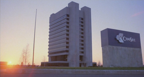
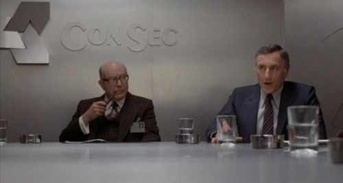
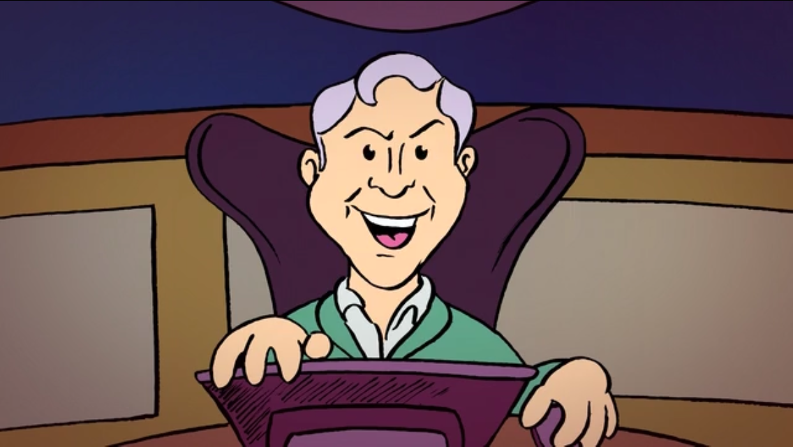
In Scanners, Consec is the amoral drug company that the hero must eventually do battle with. We came up with the phrase “securing a better future today” as an example of corporate-speak that sounds vaguely ominous.
To create the animation, I first had to replicate the logo. So I started with some screen grabs.
I brought those pics into Illustrator and created a vector image to match. It took a combination of tracing, drawing, and an existing font (Exotic Bold, coincidentally a font I had used before for my Subterranea website).

I exported the vector art in grayscale, then applied color as an overlay in After Effects. That’s a method I’ve used out in several projects, especially when I’m unsure of what color I want until I start animating.
For the animation of the logo, I constructed a landscape of horizontal lines that recede into the distance. The final step was adding “bad tracking” artifacts, which came from an effects package I bought online.
Here’s some 1980s VHS logos I took inspiration from:
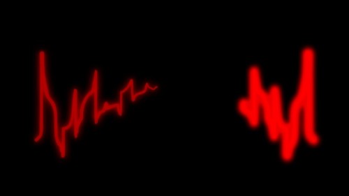
Next came the titles themselves, which I based on the original Scanners trailer. A red heart beep line, and the right font treatment were the challenge here. I went through dozens of “computer” fonts before finding one we liked. We chose to go with the red heart blip from the American trailer, but a green treatment for the font, more in keeping with some other Scanners artwork.
The Scanners trailer:
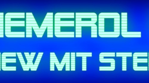
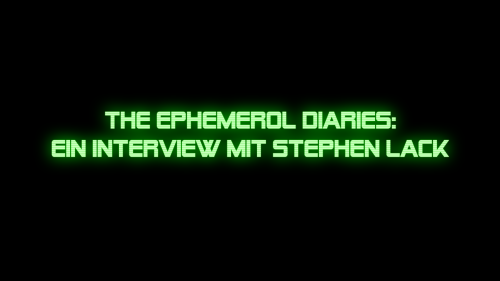
I won’t include all the title animation on this post, but here are some screen grabs from what I did.
I animated the blips using Flash, then made it glow in After Effects.
The titles were designed in Photoshop, then the glows and zooms were done in After Effects.
We were pretty happy with the resulting piece, which of course has a great interview with Scanners actor Stephen Lack. It’s a privilege to see that it has Criterion’s seal of approval as well.
For more about the Criterion Collection release of Scanners, visit www.criterion.com/films/28043-scanners
For more about DVD and Blu-ray features from END Films, visit www.endfilms.com
You may also like this
Recycle Me: A Stop Motion Musical Number
The Punch Leo Button
YOUR FACE: Global Jam

Rubber Onion Battle: Handshake Fail